
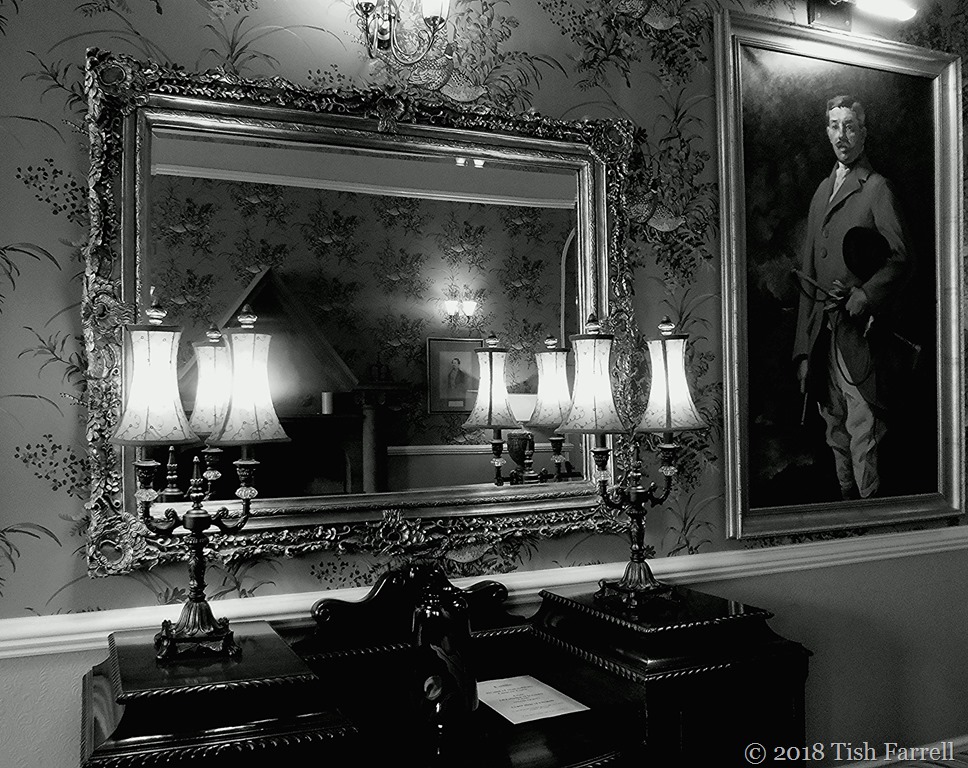

Over at Lost In Translation, one of Paula’s recurrent themes is the conversion of a colour image to monochrome. It’s always interesting discovering what will or will not work; which details become more or less significant. Sometimes there are quite striking and unexpected differences in mood. All of which is to say, I’m not sure why I even thought of converting this first photo to monochrome. As an indoor, night-time shot with too many light sources, I wasn’t expecting it to work at all. But then I found I rather liked the monochrome version. It somehow has a more formal or stately feel about it. It was taken in the hall-drawing room of St. Bride’s Castle.
Coming up is the front entrance. I don’t think the conversion does much for the image here:


*
This next exterior shot perhaps works better: austere geometrical silhouette against active clouds:


*
And I do rather like this clump of monochromed daffodils found in the castle grounds:


Black & White Sunday: After and Before
More about St. Bride’s HERE
In which Six Go Potty In Pembroke With Cockapoo Puppy – holiday snaps #10

Interesting effect. Good on some …not so good on others.
That’s what I thought 🙂
I’m in agreement!
This is a first for me to like all the B/W’s better than the color – but I went over them three times (how fun to do with such rich images – details in the lamps, flowers, sky, etc.) and yup – the black and white versions seem to be my preferred ones.
and cool place.
You are a whizz, Yvette. So much thoughtful attention on your part 🙂
oh you are too kind – hope you have a nice rest of your weekend T
I have never tried b&w. This was amazing. Thank you.
You’re most welcome 🙂
It’s obvious you’re not spending much time at that allotment, Tish (or in the study? 🙂 🙂 ). You can give me a good slap, if you like. It’s been dismal up here. Sadly your prophesy seems to”ve been right. Good job on the conversions though. The first is my favourite but oddly I rather like the daffs too.
Too wet and muddy to go to the allotment. Maybe tomorrow…
After eggs and toast soldiers, you’ll be fortified. 🙂 🙂
Oh now that’s a good idea.
I’m surprised at how much I like the first three sets in black and white. Not so fond of the last one — I need yellow daffodils, but the others look good. The “castle” or manor or whatever it is looks entirely different in black & white, too. In monochrome, it’s grim and dark, but not at all in color. Great pictures and combinations.
Many thanks for all those observations, Marilyn.
I agree about the interior pair. I prefer the b&W, I think because it adds sense of age and mystery to the scene. The same with the exterior of the castle. Maybe I watched too much B&W television and old movies when I was a kid. 🙂
Many thanks, Marie. As to watching too much b & w television and old movies as a child – you and me both! Happy Easter.
Colour, colour, colour for me especially the daffodils. They HAVE to be yellow!! But I do like the exterior of the castle in its entirety, such a dramatic cloudscape.
I bow to your predilections, Jude. But it’s good to play.
Of course. And I meant that the entire castle looks good in B&W.
Not a subject i would have thought of, but the lighting makes it work really well.
Thanks, Gilly.
You sometimes can’t tell what will look good when desaturated. The daffodils are quite surprisingly dramatic.
They surprised me too 🙂
You are really good at black and white renditions dear Tish. I love seeing your work, the drama of it, and it shows how good your compositions are in the first place! Thank you so much!
Thank you, Paula. You say the nicest things!