
 *
*
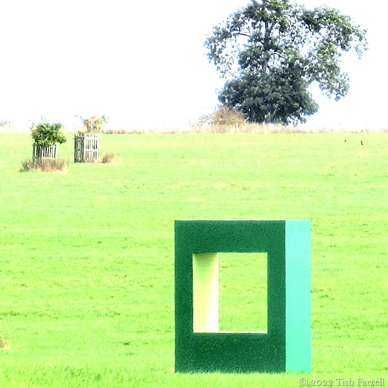
Here we have one element of an art installation called ‘Green Dwelling’. In 2021 it was sited in the Old Town Meadow of Compton Verney Art Gallery & Park, a grand Warwickshire venue for some magnificent art, ancient, old, and contemporary. Very well worth visiting.
But I’m not quite sure what to make of Green Dwelling as a whole, although for some reason I like this square. Perhaps it feels like a happier, more mundanely accessible version of Mark Rothko’s many ‘windows’, which I also admire, but find more challenging.

*
Here are the 23 other blocks that comprise the installation.


Dutch artist Krijn de Koning was commissioned to create a work that would encourage people to engage with Compton Verney’s landscape, designed by Capability Brown in 1779. It also marks the site of the lost medieval village of Compton Murdak, the blocks placed to create new framed vistas, and arranged on mown pathways that might suggest the presence of the ancient settlement.

Well, as I said, I’m not quite sure what to make of the whole; perhaps more appealing in the conception than the physical manifestation. Perhaps, too, if I’d thought to venture closer, I might have become more involved. On the other hand, it looks to me as if the landscape, domesticated as it is, needs no such cues of engagement. In fact it rather outdoes the structures.
If I had walked to the further side of the square and looked through, I might have seen this kind of vista: Compton Verney Manor, essence of classical architecture – symmetry, perspective and lots of angles…


oh I liked just the one on its own, but lots of them seems superfluous. Think your review is the right one!
Thanks, Becky.
Happy new year🎸
Thank you, Satyam.
❤
Hmmm..I’m no sure either but the manor house is nice.
When I saw your first shots I thought, I really like that, why is Tish ambivalent? But when I saw all of them scattered across the grass I understood why you felt like that. I think it’s maybe a lack of coherence between the separate elements? I know the colour scheme is coordinated but they just look too random. But a perfect choice for geometry squares month!
Exactly my thoughts over the various elements. They didn’t seem to have been placed very well at the foot of the hill. Underwhelming, but as you say, just the job for squares.
A fun post. But in the case of the exhibition, perhaps less is more?
Much of it lost in the landscape despite the bright colours.
We liked the green square installation at Compton Verney too
It had a certain something.
Interesting… If it gets people to come, if it gets people to notice, if it gets people to comment… it’s working.
The thing is Thom, the collections in the house and in the immediate garden, are altogether more enthralling, but yes, I also agree with what you say. Apart from the green square, which was slightly elevated, I think one of the problems was poor siting of the other elements.
a green box in a green field…Definitely underwhelming. But the manor house hits the mark for me.
Bernie
It is quite something – the manor house. And its collections are even more eclectically fabulous.